
Good lettering needs short, carefully checked text and enough space. Have any text in a foreign language checked by a native speaker rather than relying on a translation app. Choose a font that suits the size and placement: a fine script looks lovely on paper, but it can blur over time if it's too small. Before the session, check every single letter in the design.
What to write
The most popular choices are a name, a date, a single word or a short phrase. The shorter the text, the better it looks and the longer it stays readable. A long quote needs space, and on a small area it turns into a line of tiny print.
- A name or a date — to mark a child's birth, remember a loved one or commemorate an important day.
- A single word — something you want to remember about yourself.
- A short phrase — a line from a book or a letter, a family saying.
- A loved one's handwriting — a signature or a word from a card, transferred exactly as it is.
It's worth waiting before getting a partner's name tattooed at the start of a relationship. Read why in “Should I get a tattoo?”.
Lettering in another language
Tattoos in Latin, Japanese, Hebrew, Arabic or Sanskrit can look beautiful, but there are risks. Translation apps can get word forms wrong. With a different writing system, even the direction of the text or the way the letters join can be wrong.
Don't trust translation apps or pictures from the internet. Ask a native speaker to write the phrase out by hand and explain how it actually comes across. Ideally, ask two different people.
For the meaning of characters and signs from other cultures, see “Symbols and cultural context”.
Font and handwriting
A font changes the feel of lettering more than you'd think. The same word can look formal in block letters or softer and more personal in script.
- Sans-serif lettering — simple and readable, holds up well at a small size.
- Serif — classic and “bookish”, works better at a slightly larger size.
- Script — lively, but the thin joins can blur together over time.
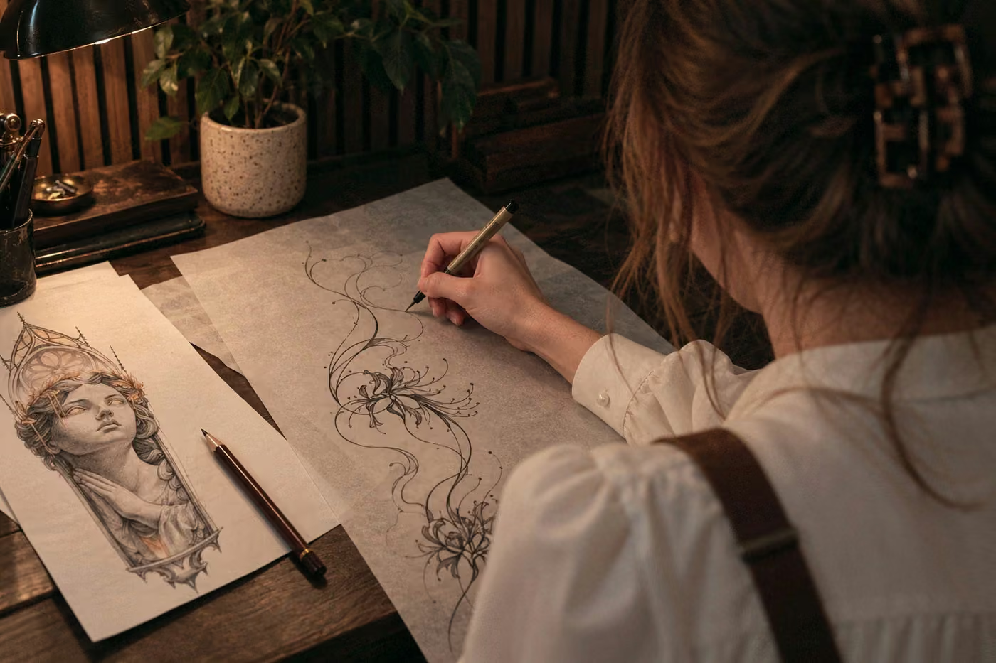
- Calligraphy and blackletter — striking, but these need plenty of space and an experienced artist.
Size and letter spacing
Letters need space around them, just like the lines in a design. Over time the pigment spreads a little, and the spaces inside letters such as “a”, “o”, “e” and “b” fill in first. If letters are too close together, the word becomes hard to read within a few years.
The minimum letter height depends on the font: simple block lettering needs less space, while script and calligraphy need more. Your artist will tell you how large the lettering needs to be.
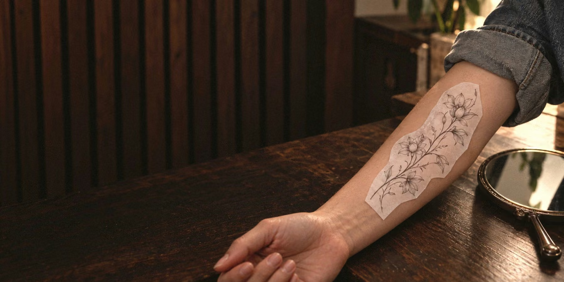
Before the session, I ask you to read the lettering on the stencil at arm's length. If you stumble over it, it's better to make it bigger or choose a simpler font. It won't look any clearer on skin than it does on paper.
Where lettering looks best
Lettering works well on long, flat areas: along the forearm or collarbone, down the spine or across the ribs. On the fingers and side of the hand, letters often blur and need touch-ups. On my lettering tattoos page, I explain how I choose the font and position the letters to suit your body.
Decide in advance who the lettering is for. If it's for you, it's placed so you can read it yourself. If it's for other people, it's placed so they can read it easily. On the forearm, that means two different orientations. More on placement in “Choosing your tattoo placement”.
Checks before the session
A mistake in a design might go unnoticed, but everyone will spot a mistake in lettering. Before your artist picks up the machine, check:
If a mistake does happen
It happens. Sometimes a mistake can be fixed by adding or redrawing a letter. Sometimes it's easier to cover the lettering with a design or remove it with a laser. The options are covered in “Covering up an old tattoo” and “Tattoo removal”.
Frequently asked questions
People are especially picky about lettering — and rightly so. Can't find your question? Message me on Telegram or Instagram. I reply personally.
Can you tattoo a loved one's handwriting?
Yes. Bring a photo or scan of a card, letter or signature. Your artist will clean up the lines and choose a size so the handwriting is recognisable and heals well.
How small can lettering be?
It depends on the font and the number of letters. A simple word in block letters can be fairly small; a long phrase or script lettering needs more room.
Can lettering be done in colour?
Yes, but black reads more clearly and lasts longer. Light colours fade in the sun, and the letters lose contrast.
What if my lettering has blurred over time?
Sometimes a touch-up helps, sometimes a cover-up. Show the tattoo to an artist and they'll tell you what's possible in your case.